Eventure
A welcoming campus app that gathers every event in one place. Simple to browse, simple to personalize, and easy to jump in.
By: Kayla Tang
Artist Statement
Eventure started as my response to a problem I experienced firsthand: feeling disconnected from all that college has to offer. I wanted a space where campus life, including club meetings, sports, fundraisers, and social events, could come together so students could explore, engage, and never miss meaningful moments.
Designing Eventure became more than building an app; it became about creating a digital space that feels alive and welcoming. Features like personalized onboarding, smart event discovery with reminders, interactive maps, and media recaps were all crafted to help students feel connected to their campus, their peers, and the experiences that shape their college years.
Through this project, I realized how much I value designing experiences that are both functional and human. Eventure reflects my belief that good UI/UX should feel thoughtful, personal, and capable of turning everyday interactions into moments of connection.
Project Description
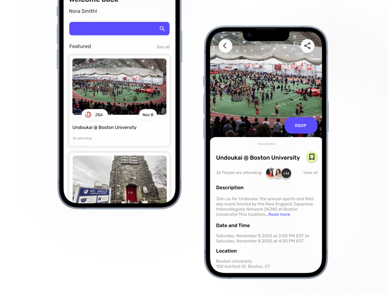
Eventure is a mobile app designed to help students stay connected to campus life by bringing all events into one centralized space. From club meetings and sports games to fundraisers and social gatherings, the app makes it easy for students to discover what’s happening, follow their interests, and make the most of their college experience. Key features include personalized onboarding, smart event recommendations with timely reminders, an interactive campus map for easy navigation, and media recaps that let users revisit highlights or catch up on what they missed. Eventure aims to create a more engaging, connected, and accessible campus experience for every student.
Key Features
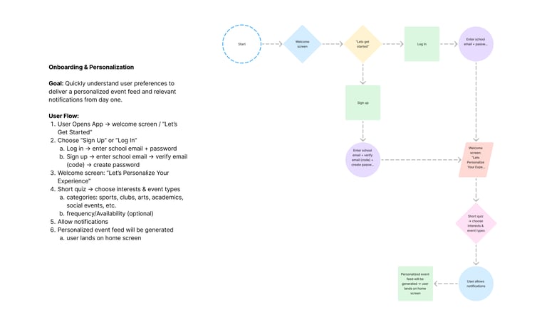
Onboarding & Personalization
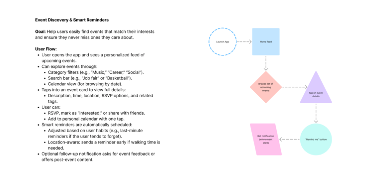
Event Discovery & Smart Reminders
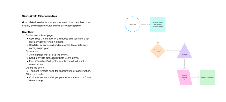
Connect with other attendees
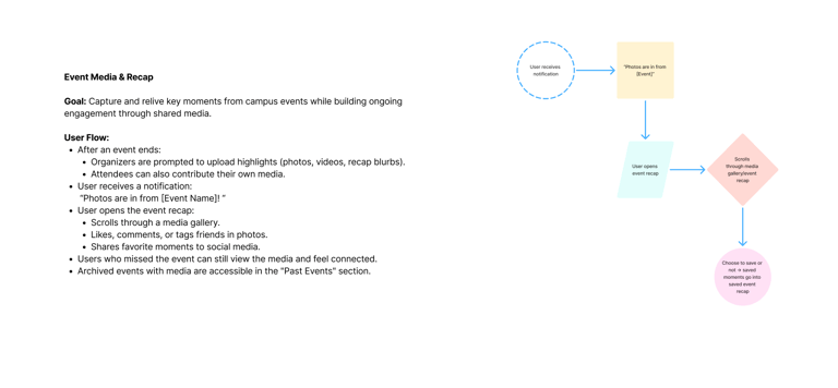
Event Media & Recap
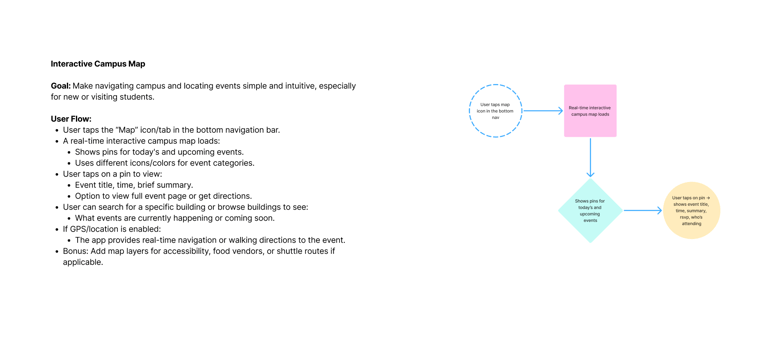
Interactive Campus map
User Research
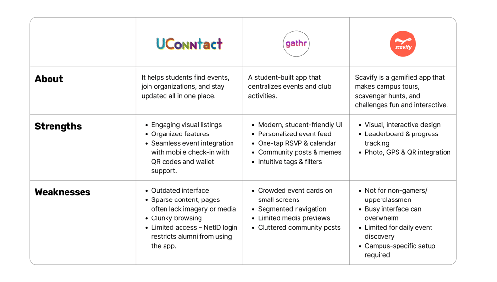
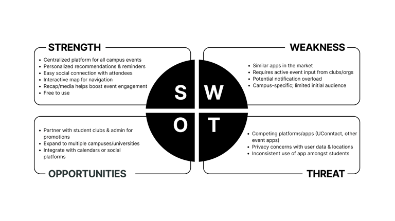
In my research phase, I focused on studying 3 different competitors to understand how similar apps serve students and what gaps exist in the market. I conducted a detailed analysis of a specific competing app at UConn, UConntact, to evaluate its features, usability, and overall user experience. By examining how it organizes events, allows users to filter interests, and sends notifications, I was able to identify strengths to emulate and weaknesses to improve upon in my own app design. This research laid the foundation for creating a solution that better meets students’ needs for staying informed and engaged on campus.
01
02
Anaylsis
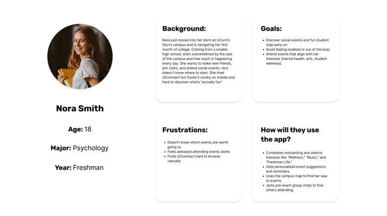
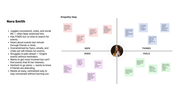
In the analysis phase, I synthesized insights from my research to better understand student needs and pain points. I created user personas to represent different student types, mapped user flows to visualize how they navigate events, and developed empathy maps to capture their motivations and frustrations. A SWOT analysis of competing apps helped identify strengths to build on and weaknesses to improve. Together, these tools revealed patterns and opportunities that directly informed the design of a more intuitive, engaging campus events app.
03
Userflow Charts
03
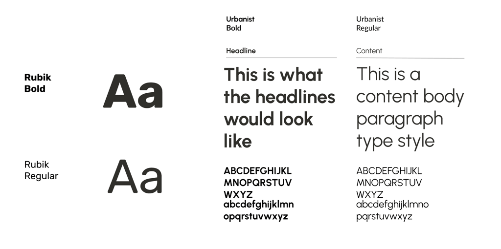
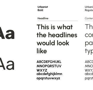
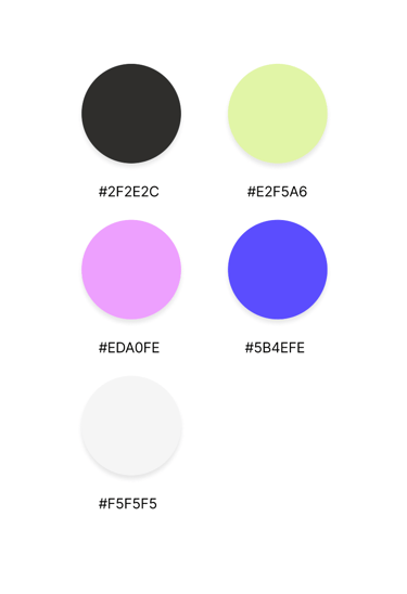
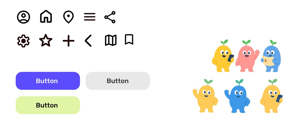
Typography, Colors, Assets
04
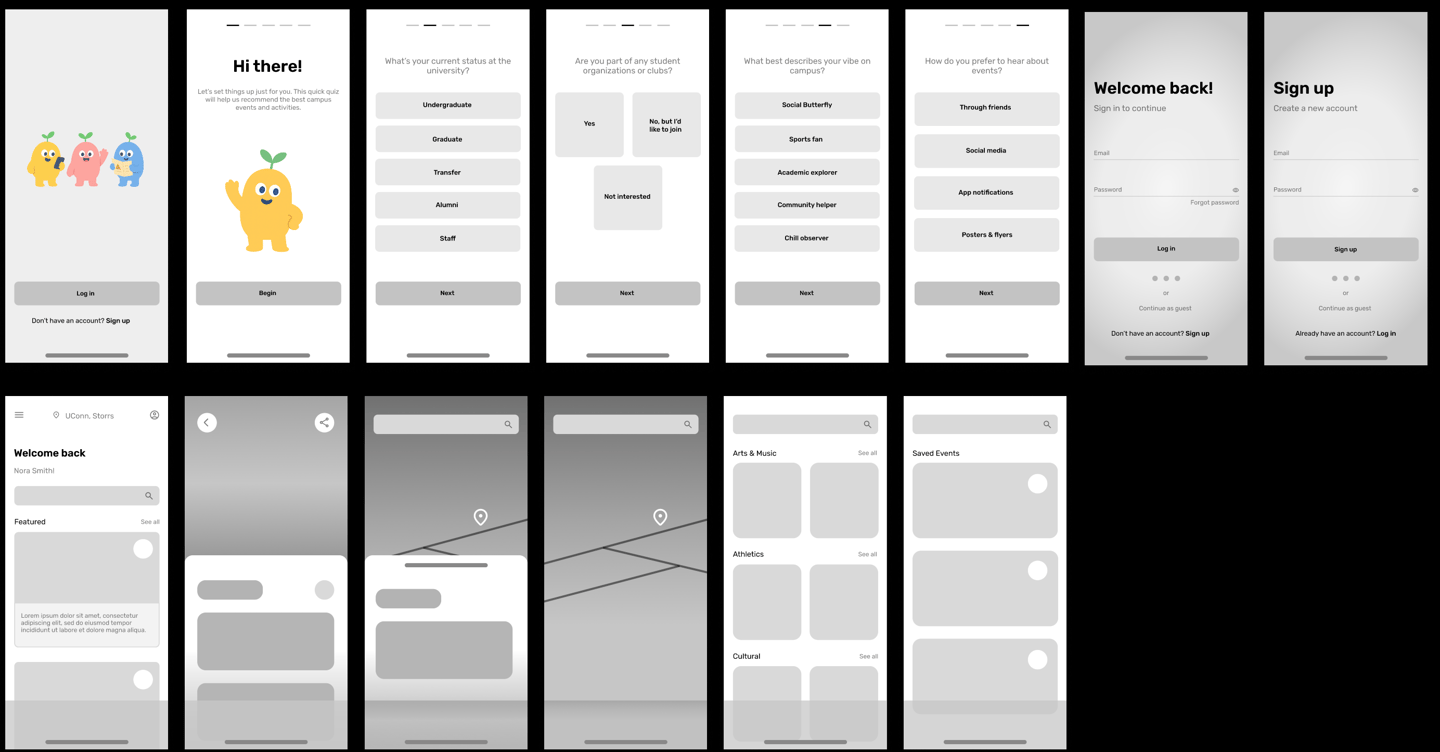
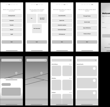
Low-Fidelity Wireframes
05
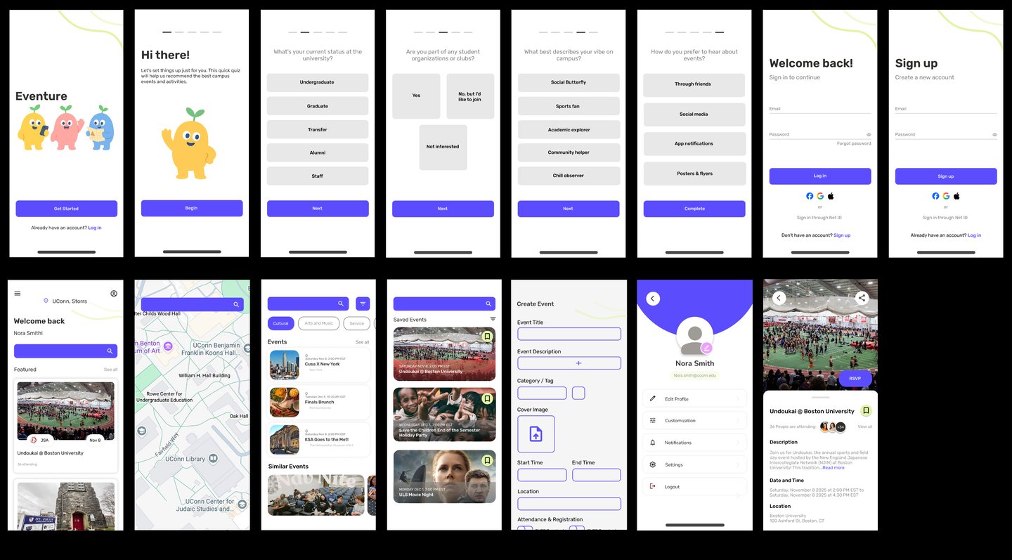
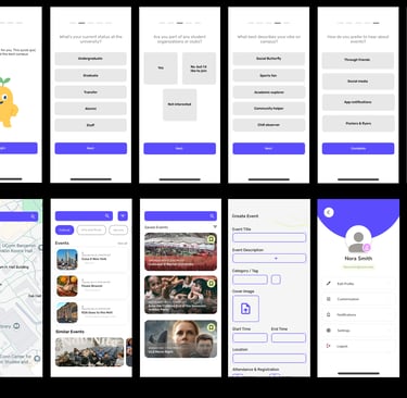
Hi-Fidelity Wireframes